Overview Understand Define Ideate Design Reflection Style
Screen 1
OVERVIEW

Designing Digital Products for Women's Health

Case Study: quick and simple data collection.

Link to Prototype
Screen 2

Summary

Redesigning the PhenomX Health app to make data collection:

Quick
Simple
Engaging

Women need to feel motivated to share the information needed, so the app can create personalized reports with health recommendations.

Screen 3

What happens with the current app?

PhenomX Health is an app that relies on data intake to provide personalized reports with nutrition, supplement, and lifestyle recommendations.

Phone Screen 1 Phone Screen 2 Phone Screen 3 Phone Screen 4
Screen 4

The current Loop

The App relies on data collection to provide Reports

While the app aims to reduce symptoms and support health, women find it overwhelming and confusing, discouraging them from completing the process.

This prevents the app from collecting the data needed to run the personalized reports.

Current Loop Diagram
Screen 5
Project Overview

What will I do?

Design an engaging onboarding intake form that gathers the essential data to provide personalized recommendations as soon as the user lands in the app.

Simplify data collection
Show immediate value
Meet both user needs and product goals.

This real-world project will include weekly meetings with Colleen, the founder of the PhenomX Health app, to share progress, gather feedback, and align on next steps.

Constraints:

This project has a limited timeframe and budget, so it must be developed in phases that can be implemented gradually.

Screen 6

Timeline

This project was a 14-week engagement, broken into clear phases:

UNDERSTAND

week 1–6: Research, user interviews, competitive analysis

DEFINE

week 3–8: Archetypes, user journeys

IDEATE

week 7–10: User flows, information architecture

DESIGN

week 9–12: Wireframes, hi-fi designs, animations, prototype

TEST

week 12–14: User feedback, refinements, next steps

Screen 7
UNDERSTAND

User Research & Competitive Analysis

Screen 8

User Research

I will conduct interviews with professional women between the ages of 40 to 50 to understand:

Health priorities
Menopause awareness
Symptoms awareness
Tracking habits

Screen 9

What I learned from the interviews

Learnings from interviewing 10 women:

Awareness

Limited knowledge and stigma

Women in their 40s and 50s often have little understanding of menopause stages. The word carries negative associations, so symptoms are rarely linked to menopause or discussed openly.

Awareness

Historical silence

Each generation feels like the first to face menopause intensely. Knowledge and tools are not passed down, making menopause poorly integrated into health and culture.

Experience

Different needs, different goals

Women with mild symptoms focus on wellness and independence, while those with severe symptoms want immediate relief. Both groups need tailored support.

Experience

The symptom overload

Hot flashes, brain fog, insomnia, weight changes, and more create a mix of unpredictable challenges. This makes the experience feel destabilizing.

Support

Doctors don't always help

Women often trust doctors but feel unheard when their symptoms are dismissed. They want empathy, validation, and practical guidance.

Support

Trustworthy information matters

Women want access to credible, science-based recommendations with supporting research they can explore if they wish.

Engagement

Need for value exchange

They are open to sharing health data if they clearly see what they will get in return. Transparency about requirements and benefits is essential.

Engagement

Tracking feels like work

Manual tracking is burdensome. Integrations with existing devices and apps would make tracking easier and encourage long-term use.

Screen 10

Secondary Research

Quiz Funnels Drive Higher Engagement

Flo and Zoe use web-based quizzes as entry points to their apps. By giving users tailored insights during the quiz and building trust with social proof and science-backed claims, they increase intent and conversion rates. This strategy highlights the value of engaging users upfront with personalized experiences before app onboarding.

Sources:

https://medium.com/design-bootcamp/how-flo-and-zoe-use-a-web-to-app-to-boost-their-conversion-6f424171b1b7

https://www.retention.blog/p/flo-is-an-amazing-success-story

https://uxdesign.cc/what-i-learned-from-leading-apps-about-signup-and-onboarding-f58921d69e30

Women are searching for health information online, but they don't necessarily trust what they find.

Women are active health trackers, but they're not always using digital tools.

To encourage digital tracking across other metrics, digital solution providers should consider addressing barriers to tracking like clunky data entry, building capabilities around high-value indicators for women, and helping women turn data into useful insights.

Source:

https://rockhealth.com/insights/women-in-focus-understanding-women-as-digital-health-consumers/

Screen 11
DEFINE

Archetypes & Frameworks

Screen 12

Archetypes

The two extremes in the same range of experiencing symptoms:

The Achiever

The Achiever

"I want to have a good quality of life."

Behaviors

  • Focused on wellness
  • Busy, with no time for tracking health
  • Experiencing few or no symptoms
  • Menopause is a distant future concern

Needs

  • Trustworthy recommendations
  • Quick access to health insights
  • Low-effort health tracking tools

Opportunities for the Product

  • Integration with other apps to track health
  • Seamless data collection
The Struggler

The Struggler

"Doctors say I am fine, but I don't feel fine."

Behaviors

  • Dealing with persistent symptoms
  • Seeks professional help
  • Feels unheard
  • Experiences frustration
  • No hope

Needs

  • Validation of their feelings
  • Professional guidance
  • Symptoms management
  • A sense of progress and improvement over time

Opportunities for the Product

  • Professional support
  • Track progress and highlight small wins
Screen 13

Understanding Archetype Behaviors

Women's behaviors during their menopause transition:

Archetype Behaviors Diagram
Screen 14

Translating Behaviors into a Framework

Women's NEEDS and GOALS during their menopause transition:

Framework Diagram
Screen 15

The new loop

The New Loop Diagram
Screen 16

What does all this mean?

This means that I detected 3 Problems to be addressed in 3 Phases:

PROBLEM
Data Collection

Onboarding Intake Form

  • The app relies on data provided by the user to work.
  • Women need an easy way to provide their information.
  • An engaging Onboarding Intake Form gathers the data for the first time.
  • So users sees their personalized recommendations in a Dynamic Dashboard.
PROBLEM
Build Trust

Human tone

  • Women need awareness about menopause stages
  • Women need to trust in the app and that the information provided is verified.
  • Women need professional support and guidance
  • Women need to feel empowered and a community to rely on
PROBLEM
Data Refresh

Dynamic Dashboard

  • The app needs data refresh to adjust and update recommendations.
  • Women need an easy way to refresh their information.
  • The Dynamic Dashboard will prompt refreshing the data weekly.
  • Woman need a way to stay consistent
Screen 17
IDEATE

A New Onboarding Intake Form

Data Collection
Build Trust
Screen 18

Current App Screen Flow

Mapping current touchpoints where data is being collected.

Current App Screen Flow Diagram
Screen 19

Intake Form Mapping

What questions do I need to ask during the onboarding to capture the data required for the dashboard?

Intake Form Mapping
Screen 20

Early User Testing

Interviews with card sorting to understand:

If the form is interesting enough to keep them engaged till the end without dropping.

Testing Image 1 Testing Image 2 Testing Image 3 Testing Image 4

Learnings

Women are open to providing information if the form is relevant. Data Collection

Showing a real person behind the app will help build trust. Build Trust

The questions need to be simple and easy to digest. Data Collection

Screen 21

Intake Form Questions

Dividing the form into 5 sections:

Adding informative screens, helping with overall flow and awareness:

Intake Form Questions Image 1

To help with the cognitive load, the questions are grouped into 5 Steps.

Screens highlighted in Yellow mean that the content was tested and edited.

Most common symptoms were placed on top.

Intake Form Questions Image 2

Screens highlighted in green mean that this screen is informative and is a pause between questions.

When possible, the scales were unified.

Intake Form Questions Image 3

Providing status feedback along the way.

Screen 22

Intake Form Architecture

Intro Screens

Intro Screens

  • Learning about Colleen, the real person behind the app
  • Learning about the app, mission, and purpose
Step 1

Step 1

  • Hormonal phases assessment
  • Hormonal phases awareness
  • Hormone replacement assessment
Step 2

Step 2

  • Mood assessment
  • Health goals selection
  • Symptoms assessment
  • Symptoms ranking
  • Sleep assessment
Step 3

Step 3

  • Diet assessment
  • Allergies assessment
  • Nutritional intake
Step 4

Step 4

  • Physical activity assessment
Step 5

Step 5

  • Height and weight assessment
Done

Done

  • Personal details collection
Screen 23

Service Blueprint

Service Blueprint
Screen 24
DESIGN

Intake Form

Prototyping with Vibe Coding

Data Collection
Build Trust
Screen 25

Prototyping with Vibe Coding

Using Claude AI for rapid prototyping and user testing:

Draggable Image 1
Draggable Image 2
Draggable Image 3
Draggable Image 4
Draggable Image 5
Draggable Image 6

Findings:

Findings Image 1 Findings Image 2 Findings Image 3 Findings Image 4

Tone and Trust:

BEFORE
Before Image
AFTER
After Image

Widgets Exploration:

Widgets Image 1 Widgets Image 2
Screen 26

Roadblocks with Vibe Coding

Using Claude AI for rapid prototyping and user testing:

✓ Vibe Coding is a great tool for exploration and early prototyping, but not for high fidelity and customization.

Not able to upload / link images:

Image 1 Image 2 Image 3 Image 4

Layout not optimized for mobile first:

Vertical Image 1 Vertical Image 2 Vertical Image 3 Vertical Image 4
Screen 27

Learnings

Human tone builds more trust than a generic brand voice. Build Trust

Scales need to be the same when possible. Data Collection

Images help picture food and portions. Data Collection

The questions need hierarchies for better readability. Data Collection

Screen 28
DESIGN

Intake Form

High Fidelity Screens with Figma

Data Collection
Build Trust
Screen 29

High Fidelity Screens

Adding images to the intro screens:

Image 1 Image 2 Image 3 Image 4

Add cards with images, the calendar widget, icons, and a collapsible accordion for a quick symptoms selection:

Image 5 Image 6 Image 7 Image 8

Adding animations and image references to help users picture portions and food:

Image 9 Image 10 Image 11 Image 12

Adding the height and weigh widget with different scales and a loading animation at the end of the form:

Image 13 Image 14 Image 15 Image 16
Screen 30

User Testing Insights

BEFORE

Before Image 1

AFTER

After Image 1

User testing helps find edge cases

BEFORE

Before Image 2

AFTER

Before Image 2

The food-frequency questions were still considered confusing. After several wording iterations, a clearer phrasing was identified so that the questions could be answered without hesitation.

BEFORE

Before Image 3

AFTER

After Image 3

The symptoms were initially arranged with the most common ones placed at the top, but this order was found to be confusing. Arranging them alphabetically reduces friction.

Screen 31

Learnings

User testing helps uncover edge cases.

Swiping screens from right to left reduces cognitive load. Data Collection

Clear answer options are necessary to avoid friction. Data Collection

Showing the menopause phases increases user awareness. Build Trust

Showing Colleen at both the start and the end builds trust. Build Trust

Screen 32

Figma Prototype

Figma Prototype
Screen 33
DESIGN

Dynamic Dashboard

Data Refresh
Screen 34

Dynamic Dashboard

Rapid Prototyping with Vibe Coding

A quick visualization of the dashboard that the users will land on once the intake form is completed.

This dashboard initially has the following modules: Menstrual Cycle Tracker (if the user is still having periods), Daily Activity Tracker, Weight & BMI Tracker, Symptoms Tracker, Health Goals, Sleep Tracker, and Nutritional Advice.

The module I will expand on will be the Nutritional Advice:

Dashboard Overview Image 1 Dashboard Overview Image 2
Screen 35

Nutritional Advice Module

High Fidelity Screens

The Nutritional Advice module will display the nutritional recommendations on top and then an input and a tracking button.

Inputs:

Input Image 1 Input Image 2 Input Image 3 Input Image 4

Tracking:

Tracking Image 1 Tracking Image 2 Tracking Image 3
Screen 36

Learnings

This dashboard represents a large-scale effort, as it requires redesigning the entire app.

Due to time and budget constraints, I focused on the Nutritional Advice module for now, with plans to expand and refine the rest of the dashboard, including addressing data-refresh challenges, in future phases.

Screen 37
REFLECTION

Learnings, Conclusions & Next Steps

Screen 38

Case Study Reflection

The Why behind the project

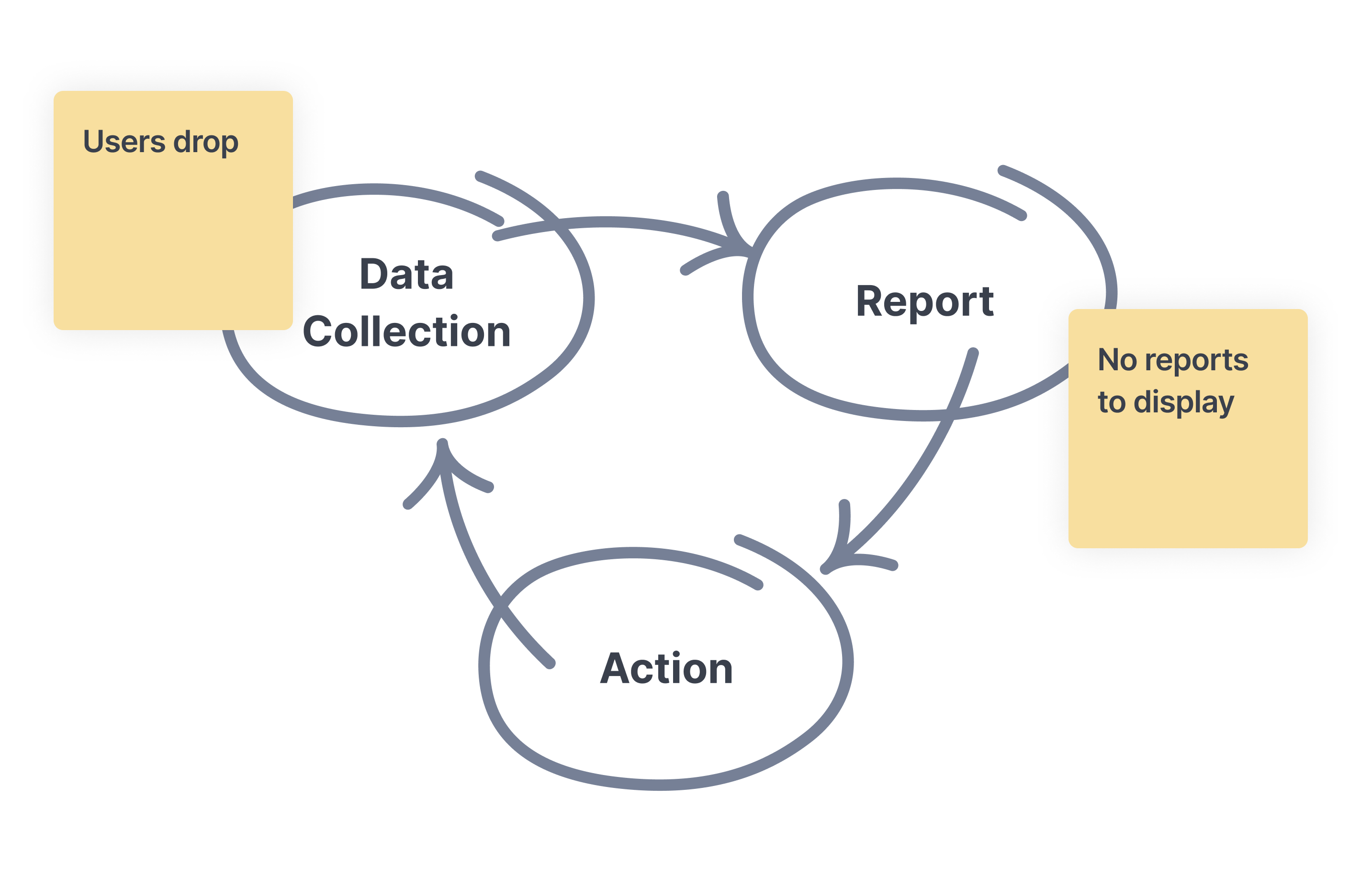
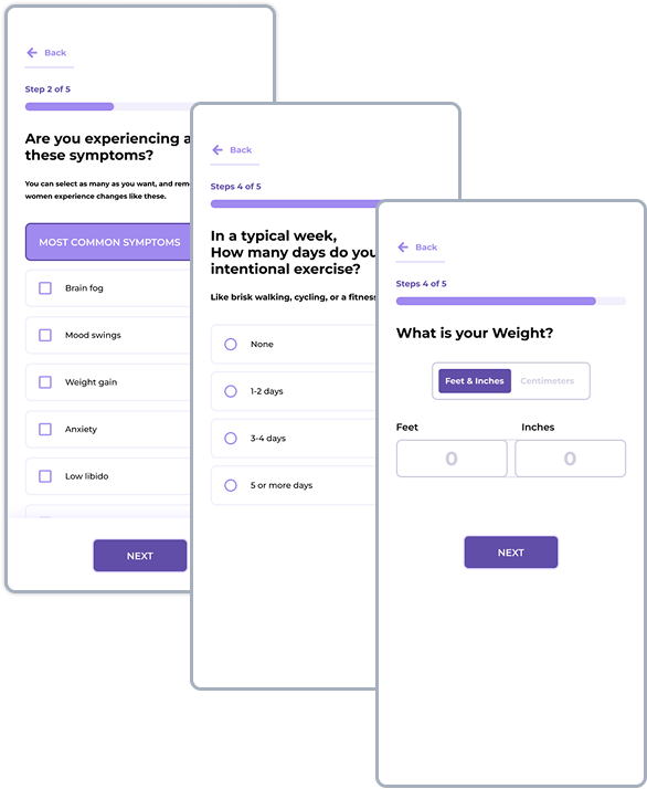
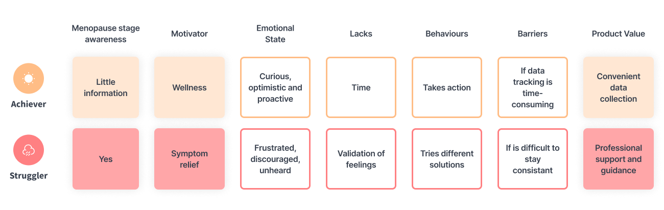
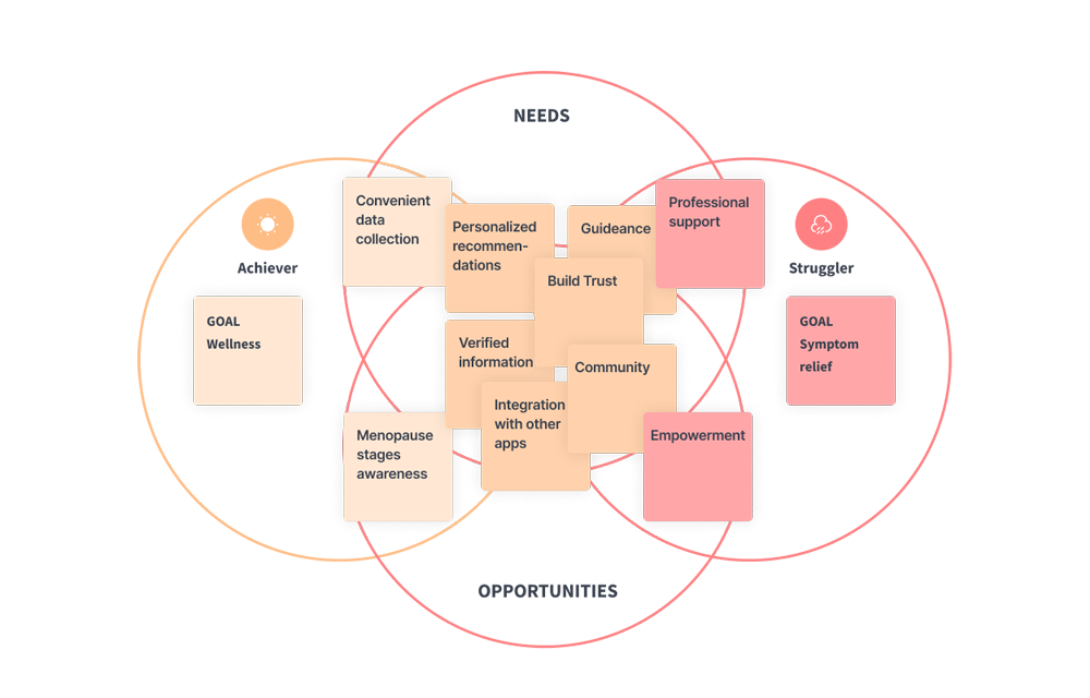
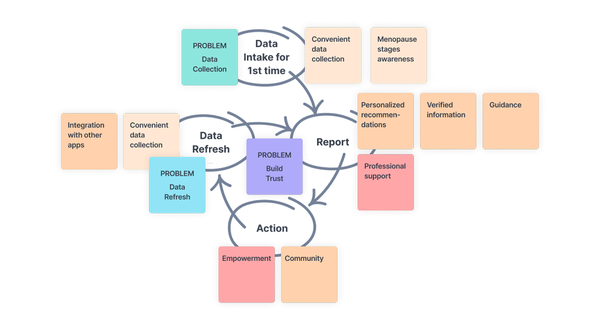
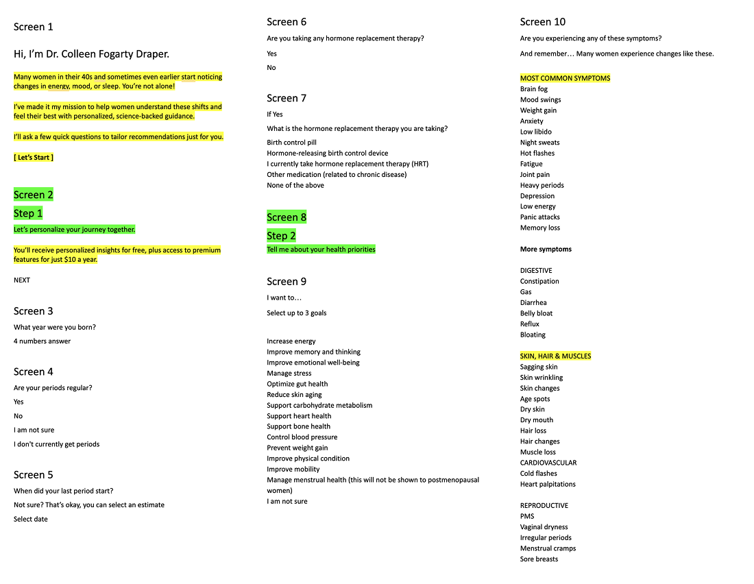
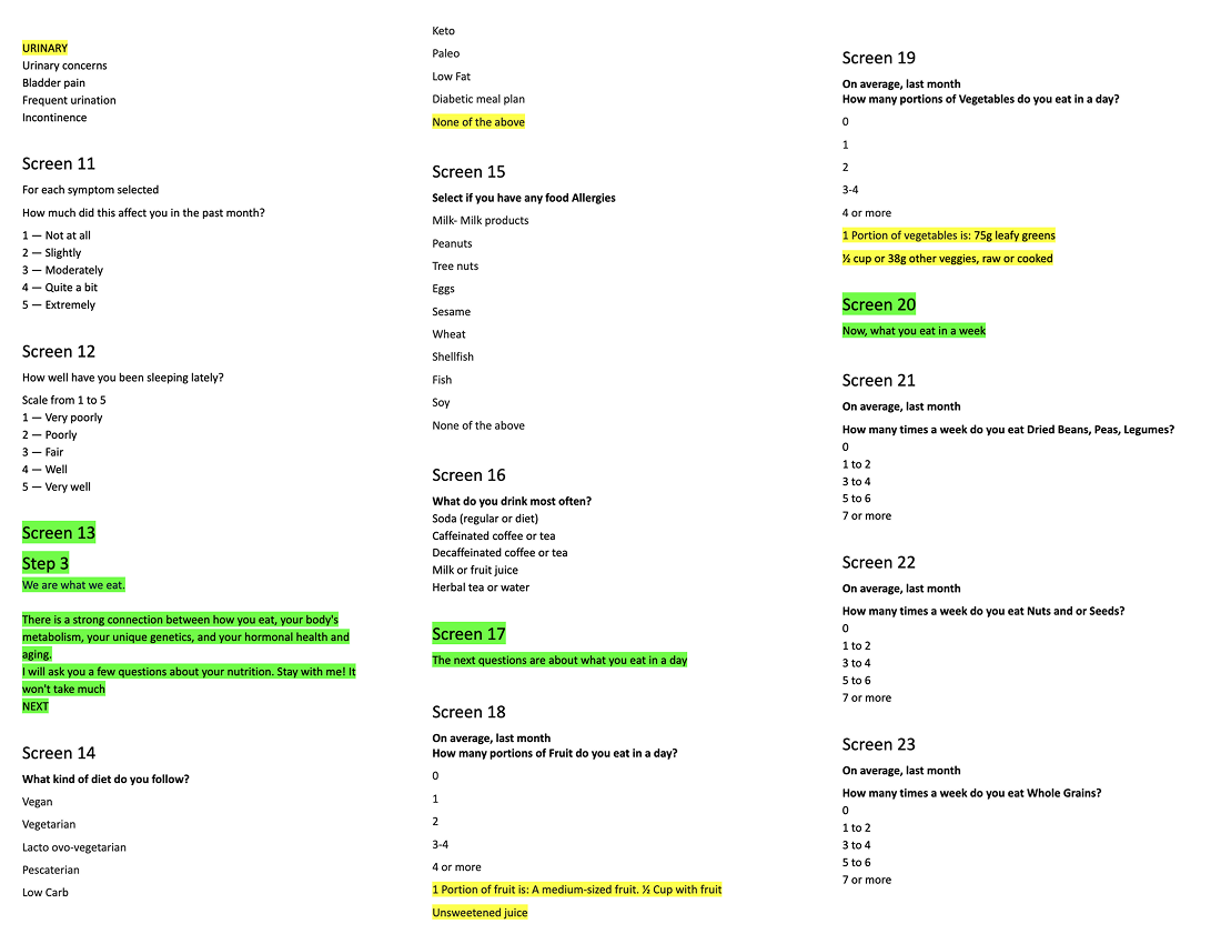
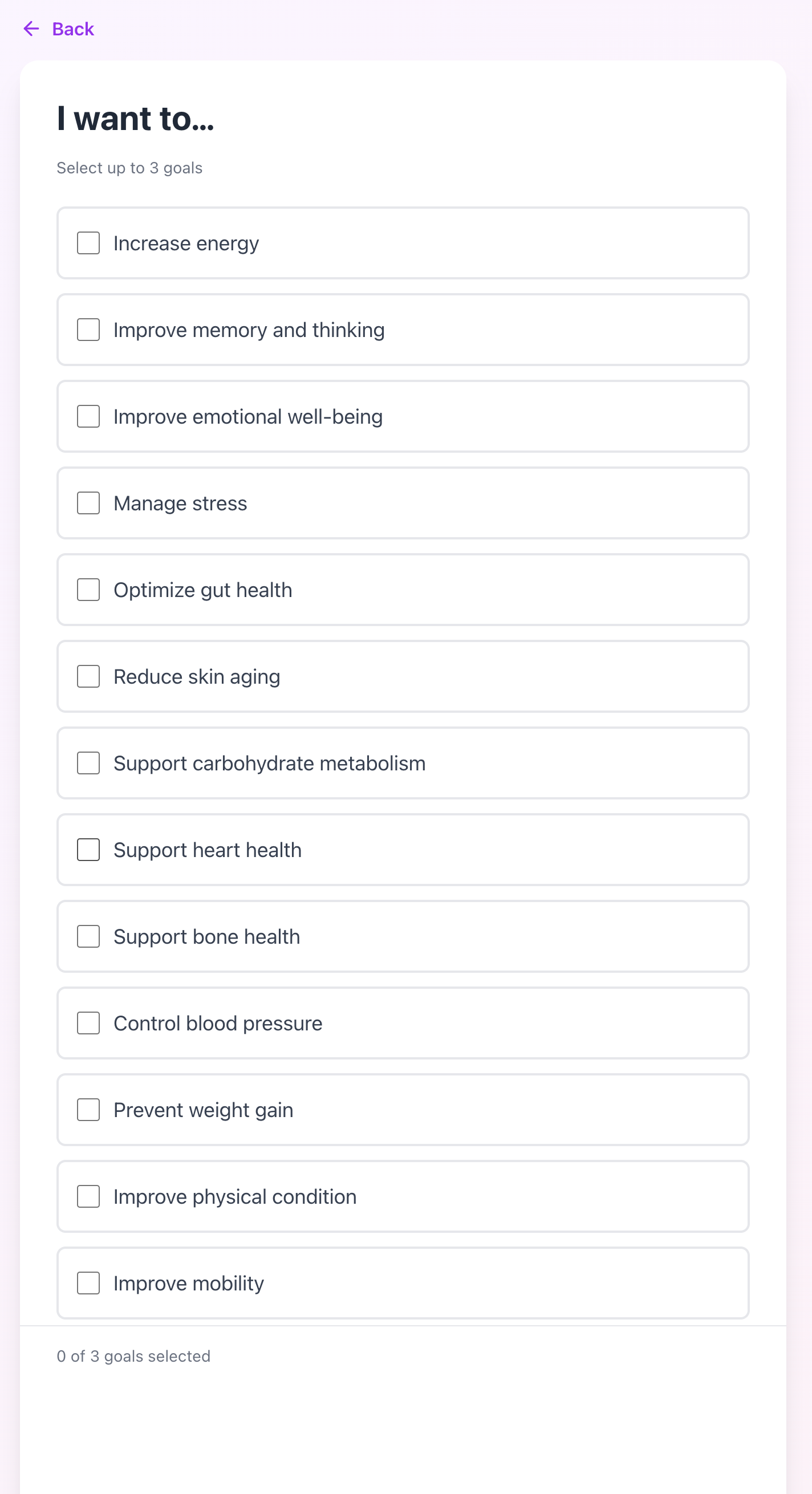
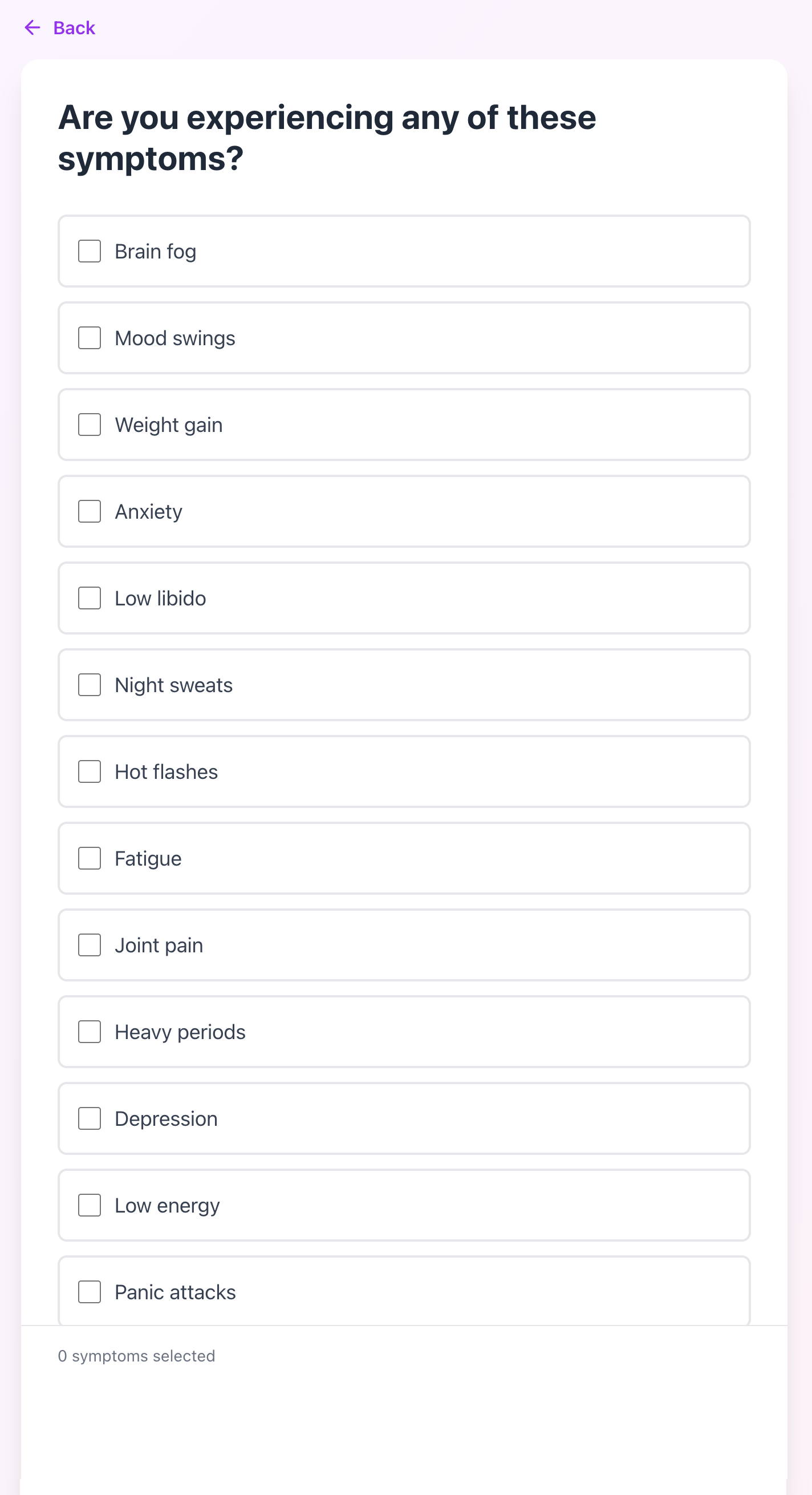
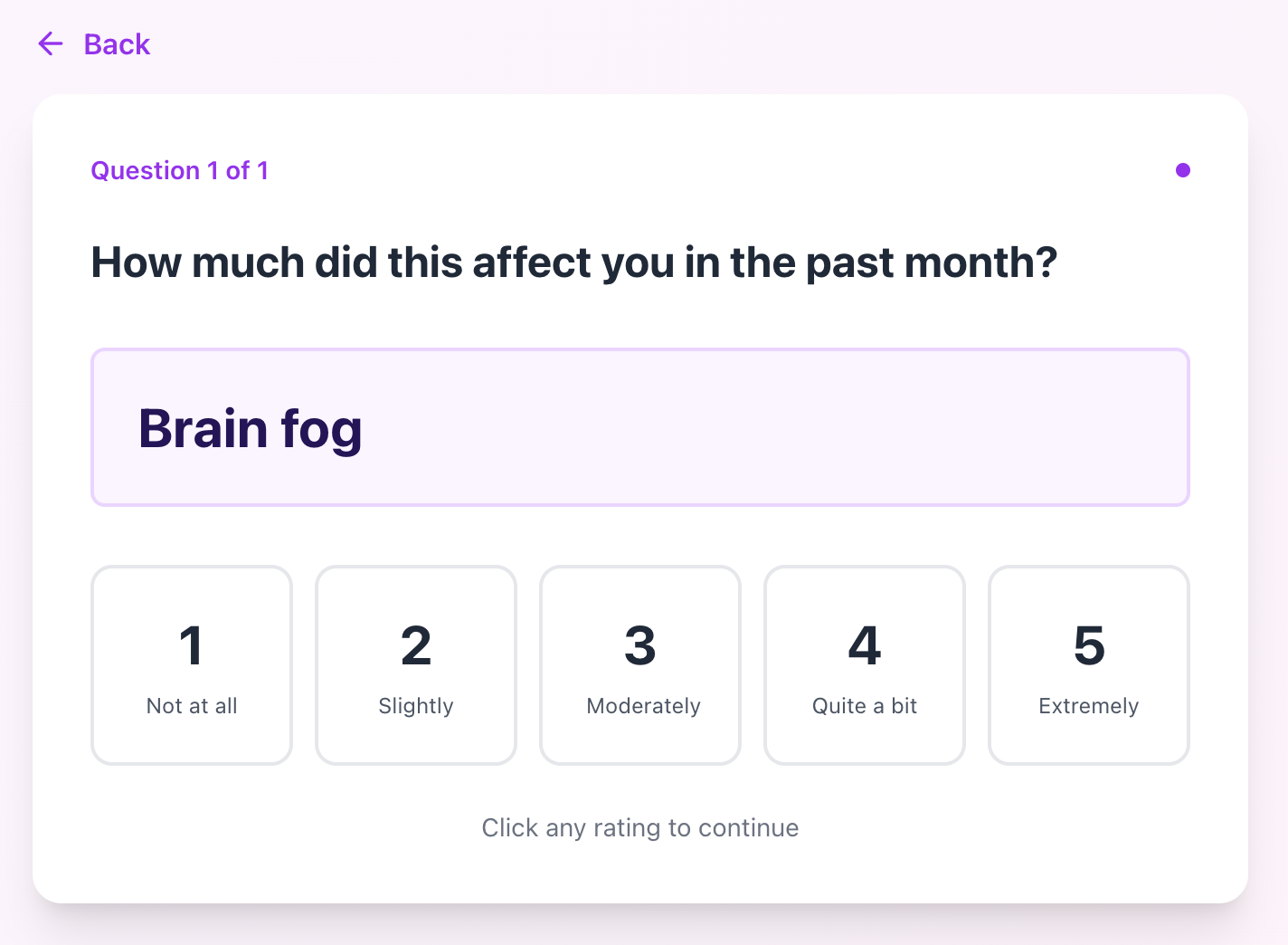
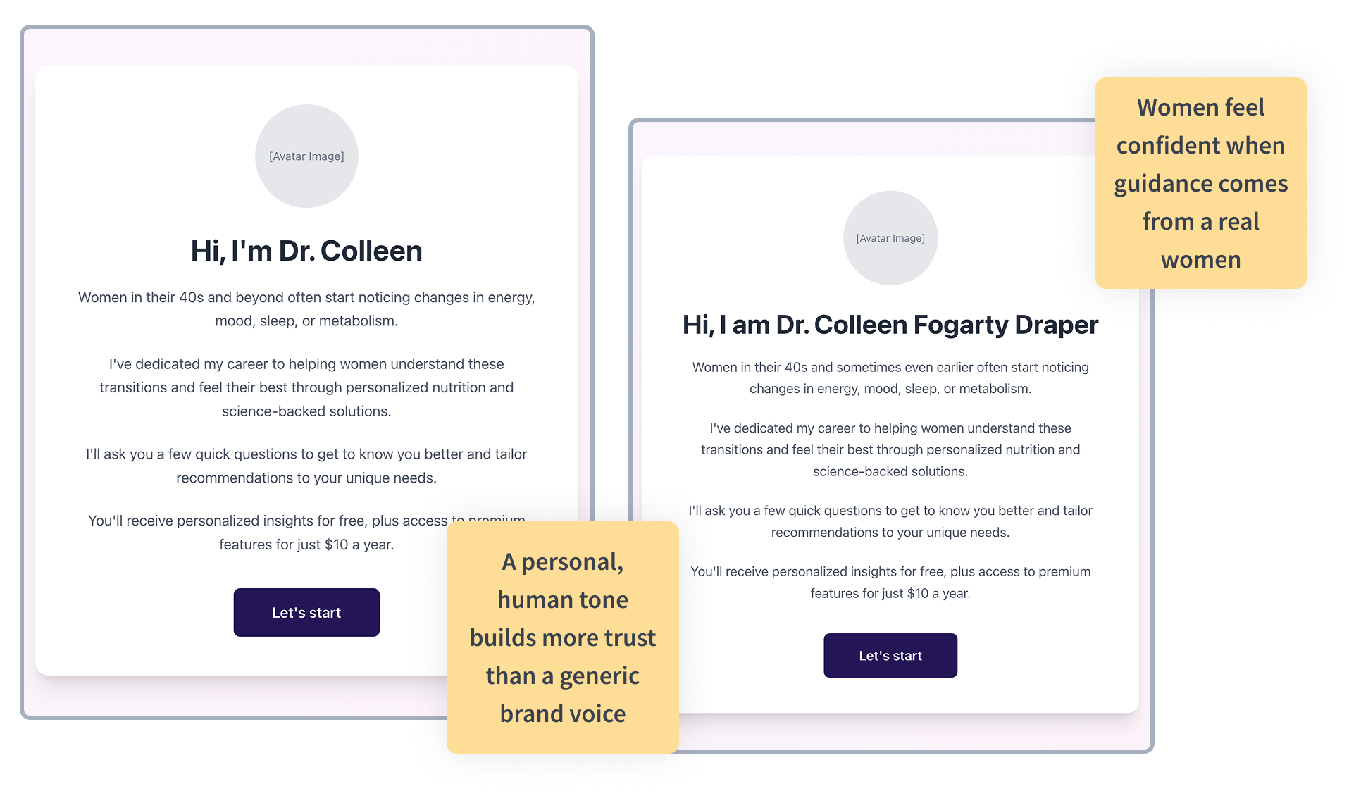
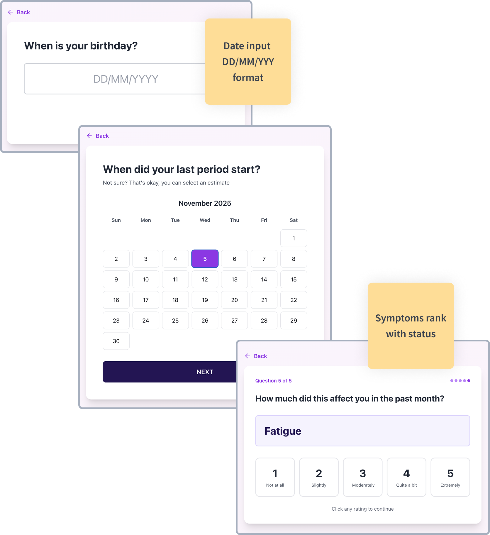
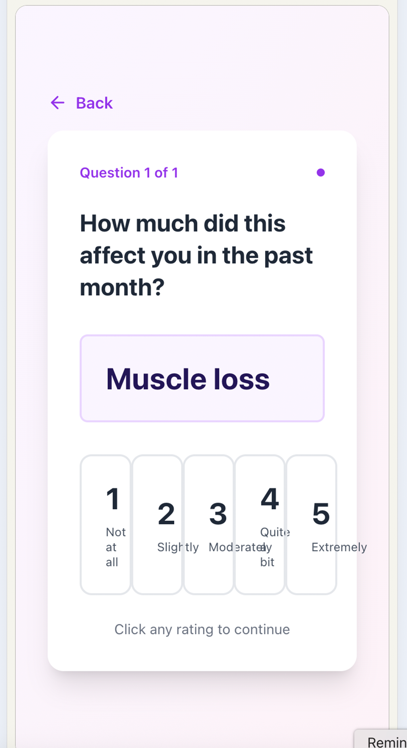
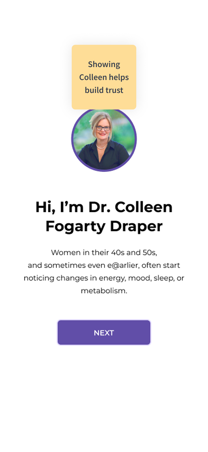
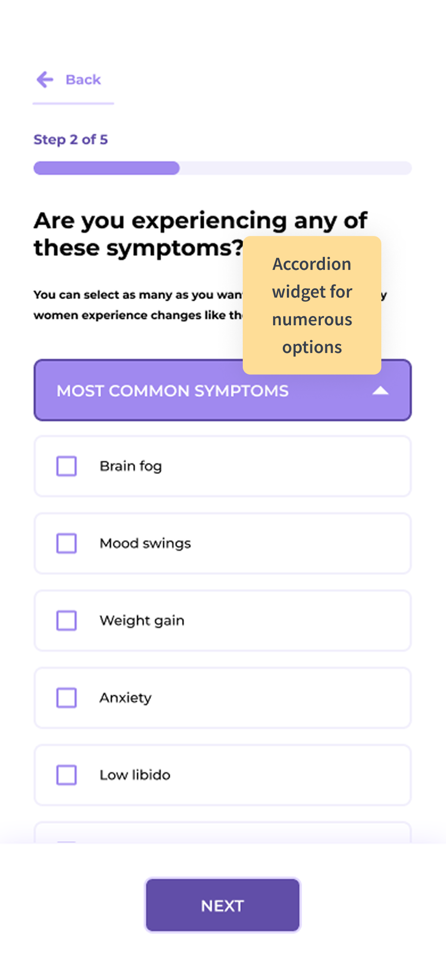
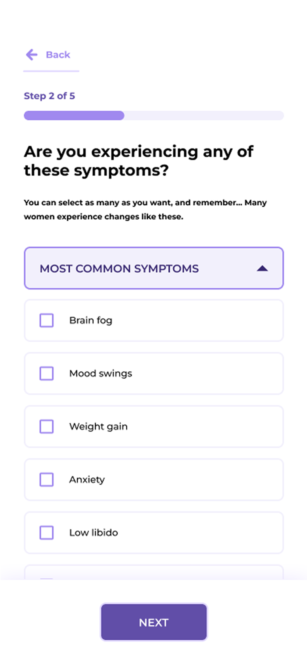
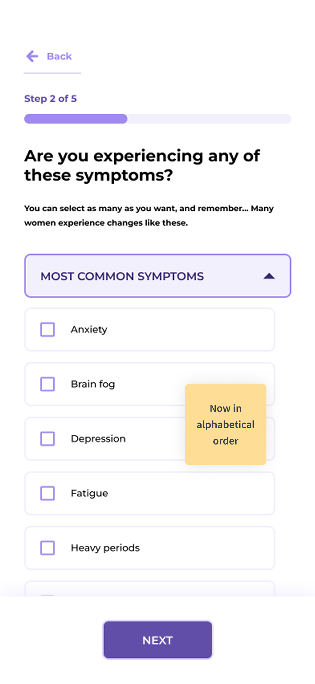
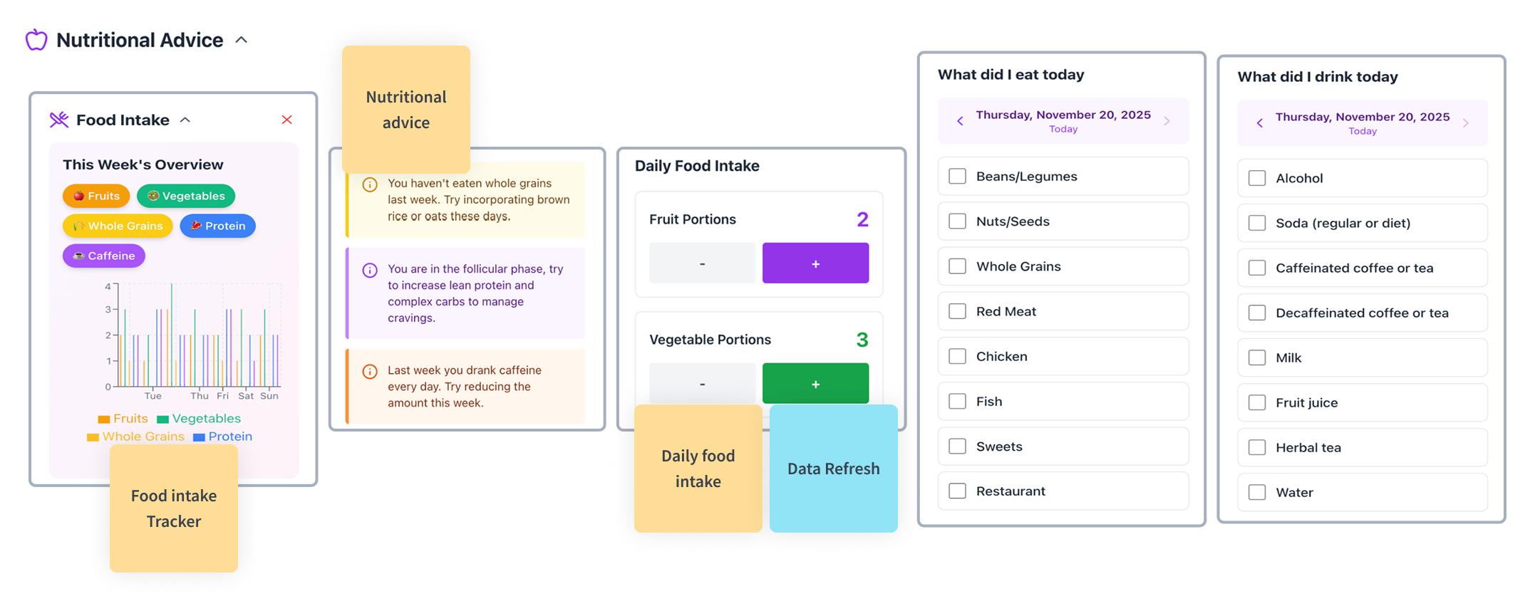
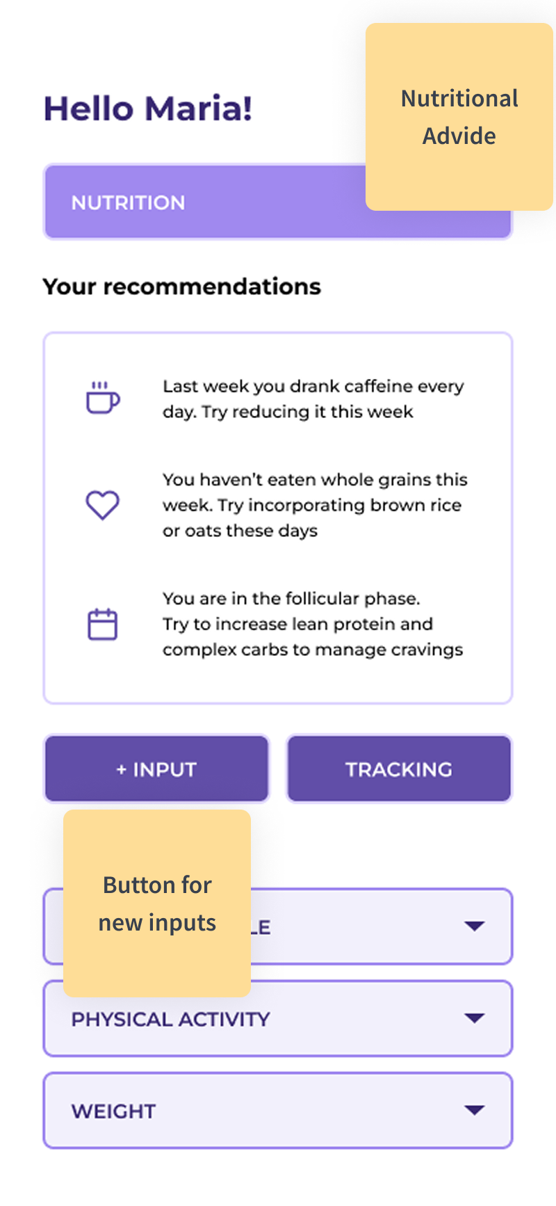
Women after 40 often begin noticing changes in energy, mood, sleep, or metabolism that feel confusing or even frightening. Many don't realize these shifts may be connected to a menopause phase, and those who seek help often feel unheard by doctors. The symptoms women experience can be numerous and are often dismissed or overlooked

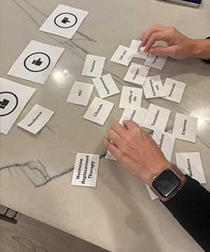
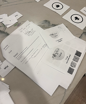
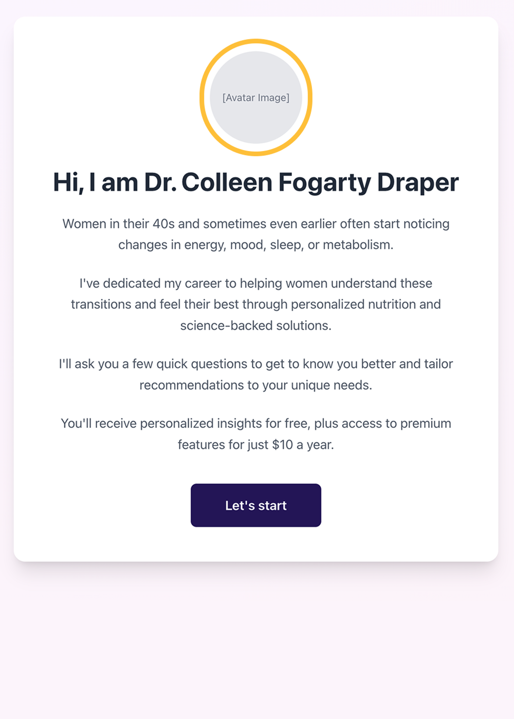
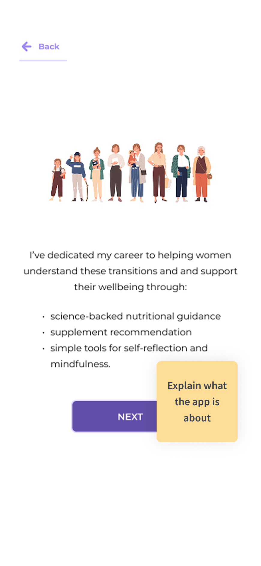
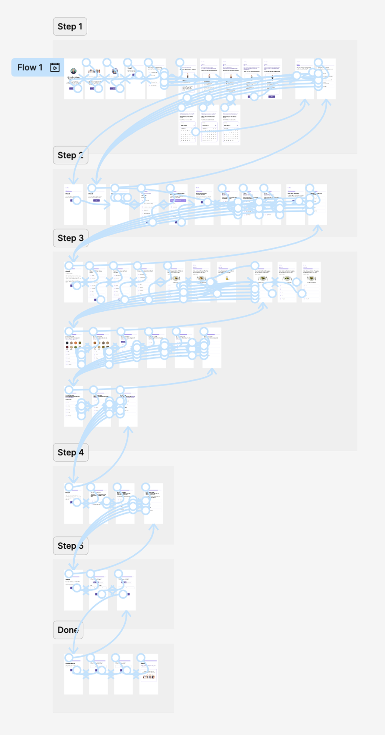
There is a limited awareness, limited research, and a historical gap in women's health. As a designer and as a woman, I wanted to work on something meaningful that supports them through this transition and guides them in a clear, accessible, and compassionate way.

The Onboarding Intake Form

This project will be developed in phases, and this was the first one. I designed a complete onboarding intake form that simplifies data collection to provide personalized recommendations. But the path wasn't straightforward.

The initial questions were confusing, some scales were inconsistent, and food types and portions were hard to visualize. During testing, I saw how small details can create hesitation and frustration and lead users to drop off. Iterating on these moments helped shape a smoother, clearer, and more engaging experience.

User Testing

User testing showed that women were able to complete the form without dropping off. They stayed engaged and were willing to share information when the questions felt relevant.

In products like this, trust is essential. Testing validated that a personal tone, and presenting a real woman behind the product, helps build that trust.

Vibe Coding

I began this project in Vibe Coding. It was a great tool for quick prototyping and early exploration, but I eventually needed more flexibility to fully customize the product. Midway through, I switched back to Figma to build the high-fidelity screens.

Later on, I discovered that I could create and assign specific documentation for every interaction, giving me more control over the final result. As next steps, I'll continue exploring how to build fully finalized products with this tool.

The Dynamic Dashboard

After users complete the onboarding, they land on a dynamic dashboard that displays personalized recommendations through different modules. This dashboard is a larger, more complex project that requires additional time and resources.

For this phase, I focused on the Nutritional Advice module. With more time, I will continue expanding the dashboard by designing the remaining modules and addressing the challenge of data refresh.

In Conclusion

This project sparked a deeper interest and opened my eyes to a space where women have long been unseen and unheard. I now understand what it means to design with care, clarity, and purpose.

My mission is to contribute to an equitable future, addressing the trust gap and creating solutions that genuinely empower and support all women.

Screen 39
STYLE

Case Study Design System

Typography

Headings

H1 - Primary Title
Inter, 56px, Bold (700), #38404D
All Page Titles
H2 - Section Heading
Inter, 36px, Semibold (600), #38404D
Section Headings & Subsections

Body Text

Subtitle
Source Sans 3, 22px, Regular (400), #38404D
Supporting description text for cover pages and section introductions
Subtitle Bold
Source Sans 3, 22px, Bold (700), #38404D
Emphasized subtitle for important section descriptions
Body Text
Source Sans 3, 18px, Regular (400), #38404D
This is the standard body text used throughout the case study. It maintains a comfortable reading length of 50-70 characters per line for optimal readability. The line height of 1.7 ensures comfortable reading while maintaining visual density.
Body Text Bold
Source Sans 3, 18px, Bold (700), #38404D
Use for emphasis within paragraphs or important statements that need to stand out. Bold body text draws attention while maintaining the same size and spacing as regular body text.
Small Body Text
Source Sans 3, 15px, Regular (400), #38404D
Used for captions, footnotes, secondary information, and source citations. Perfect for supporting details that don't need the prominence of regular body text. Maintains the same line height ratio for consistency.
Small Body Text Bold
Source Sans 3, 15px, Bold (700), #38404D
Emphasized small text for labels, important captions, or bold details in supporting content. Great for data labels and chart annotations.

Color Palette

Core Colors

Aa
Text Primary
#38404D
Aa
Border Gray
#A6AFBE
Aa
Background Gray
#F7F7F7

Gradient

Aa
Main Gradient
#FFF0E3 → #DDF6FC

Post-it & Tag Colors

Aa
Data Collection
#8DE6DD
Aa
Build Trust
#B0AAFA
Aa
Data Refresh
#90E4F5
Aa
Category
#F1A2D5
Aa
Item
#FEDD97
Aa
Achiever Item
#FFE7D3
Aa
Struggler Item
#FFA6A8
Aa
Mixed Item
#FFD1AC

Components

Gradient Label
User Research
Inter, 13px, Semibold (600), 3px border, 52px min-height
Used on cover pages for section context
Stroke Gradient Container

Key Finding

Quiz-based interfaces showed 3x higher engagement compared to traditional inputs.

Source: Digital Health Platform Study, 2024

3px gradient border, 14px radius, 28px padding
Used for highlighting important content blocks
Section Divider Gradient
3px height, 150px width, gradient fill
Regular pages (white backgrounds)
Section Divider Gray
3px height, 150px width, gray fill
Cover pages (gradient backgrounds)
Screen Number
Screen 10
Inter, 13px, Semibold (600), uppercase
Used for screen identification
Tags
Data Collection Build Trust Data Refresh
Inter, 11px, Semibold (600), 24-30px height
Inline category labels, always straight
Post-its
Data Collection
Build Trust
Data Refresh
Inter, 13px, Semibold (600), 90x90px
Key concept labels and category markers

Spacing Scale

XS - Extra Small
8px / 0.5rem
SM - Small
16px / 1rem
MD - Medium
24px / 1.5rem
LG - Large
40px / 2.5rem
XL - Extra Large
60px / 3.75rem

Typography Hierarchy

Element Font Size Weight Usage
H1 Inter 56px 700 (Bold) All page titles
H2 Inter 36px 600 (Semibold) Section headings
Subtitle Source Sans 3 22px 400 (Regular) Supporting descriptions
Subtitle Bold Source Sans 3 22px 700 (Bold) Emphasized descriptions
Body Source Sans 3 18px 400 (Regular) Main content
Body Bold Source Sans 3 18px 700 (Bold) Emphasis in content
Small Body Source Sans 3 15px 400 (Regular) Captions, footnotes
Small Body Bold Source Sans 3 15px 700 (Bold) Bold captions, labels
Gradient Label Inter 13px 600 (Semibold) Context tags
Screen Number Inter 13px 600 (Semibold) Screen IDs
Tag Inter 11px 600 (Semibold) Category labels
Post-it Inter 13px 600 (Semibold) Concept markers

CSS Variables

Font Families

--font-family-display Inter (headings, labels, tags)
--font-family-body Source Sans 3 (body text)

Font Sizes

--font-size-h1 56px
--font-size-h2 36px
--font-size-subtitle 22px
--font-size-body 18px
--font-size-small-body 15px
--font-size-gradient-label 13px
--font-size-screen-number 13px
--font-size-tag 11px

Colors

--text-primary #38404D (all text)
--gray-border #A6AFBE
--gray-light #F7F7F7
--gradient-start #FFF0E3
--gradient-end #DDF6FC
Screen 40

Thank You!